
An org of 100 people running OKRs can easily spend more than $30k a quarter just on reporting. Managers chase their teams for updates. People have to comb six spreadsheets to work out which two KRs are actually slipping. The same exec summary gets rewritten week after week with slightly different numbers. Eight tabs have to be opened side by side just to trace one dependency.
By the time the quarter ends, about 490 hours have gone into the work surrounding your OKRs rather than the work that delivers them. That is roughly one person's entire quarter, spent without moving a single goal forward.
This is the reporting cost you pay to know where things stand, and you pay it every single week.
The good news is that most of this cost is recoverable with the right tools.
Put a number on it first
Before the tools, here is the reason to care.
Take an org of 100 people using OKRs: roughly 6 on the senior leadership team, 3 program owners, 12 team leads, and 79 individual contributors. Pick a loaded hourly cost for the people who carry the reporting load. For a mid-market ops lead or manager, $65 an hour is a conservative starting point once you account for benefits and overhead. Adjust it to your reality.
.png)
Reporting dominates, and that is the real story, not a quirk of the model. Recurring weekly reporting is where the hours pile up, which is exactly why cutting it pays back hardest. Here is what sits behind each bar.
If you want to run it for your own org, the formula is simple:
(hours saved per week) x (weeks per quarter) x (loaded hourly cost) = quarterly return
Plug in your headcount and your real cadence. Even conservative inputs tend to clear the cost of the tooling comfortably, because reporting and follow-up are recurring costs. You pay them every week, which is why cutting them compounds. One honest note on the maths: this only counts the time around the work, like assembling reports, chasing updates, and clicking through plans, not the thinking itself. Writing a good check-in still takes thought. We just save the friction around it.
Here is where each of those savings comes from, tool by tool.
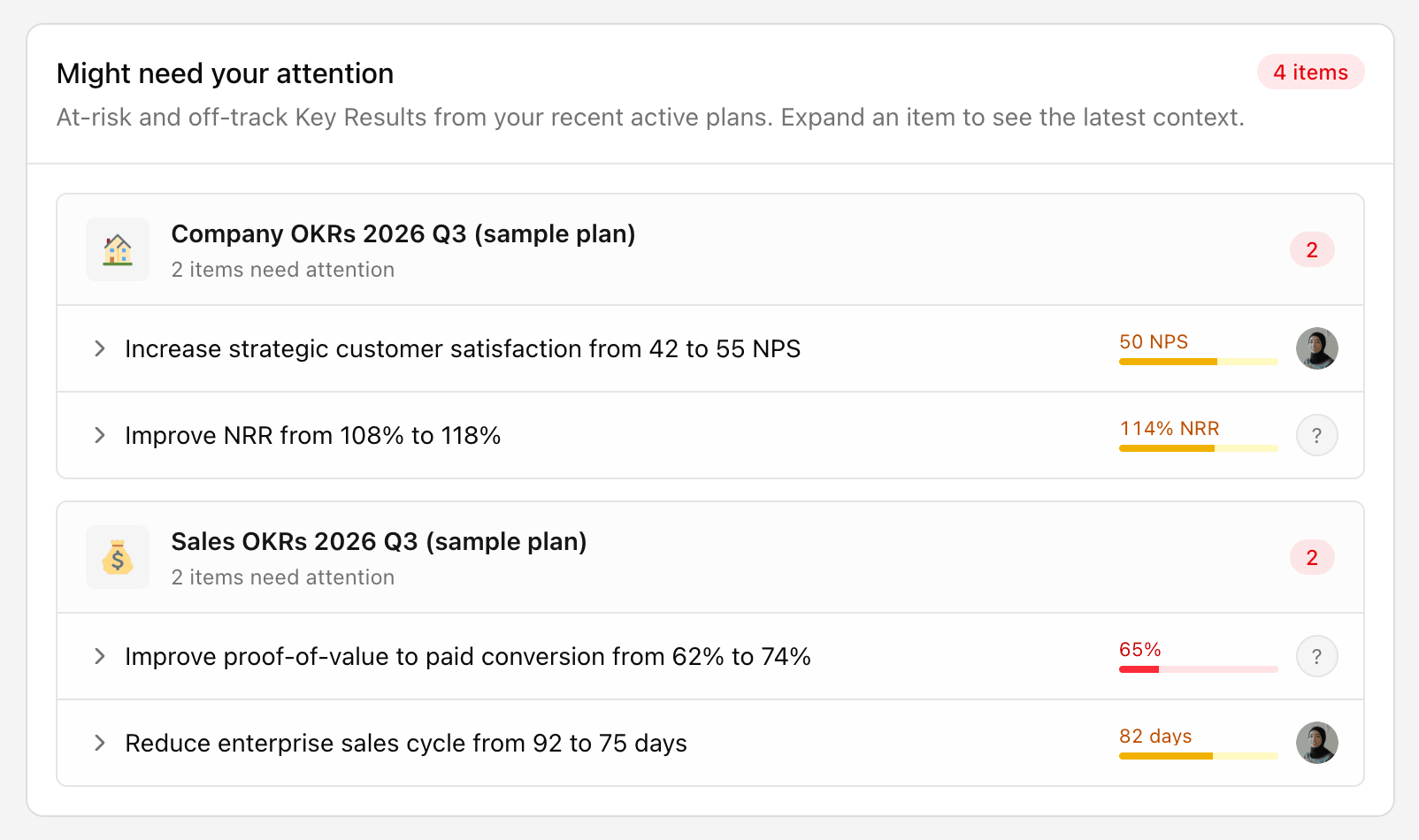
1. See what needs attention first, without opening every plan
The problem with a healthy OKR practice is that it produces a lot of data. Confidence scores, check-ins, at-risk KRs, off-track KRs, overdue updates. Once you have more than a couple of plans, finding the signal means clicking through all of them.
The Workspace Health dashboard flips that. Instead of you going to look for problems, the problems come to you. You get workspace confidence across active plans, whether it improved or slipped since last period, and a "might need your attention" section that surfaces the plans losing confidence and the KRs at risk.
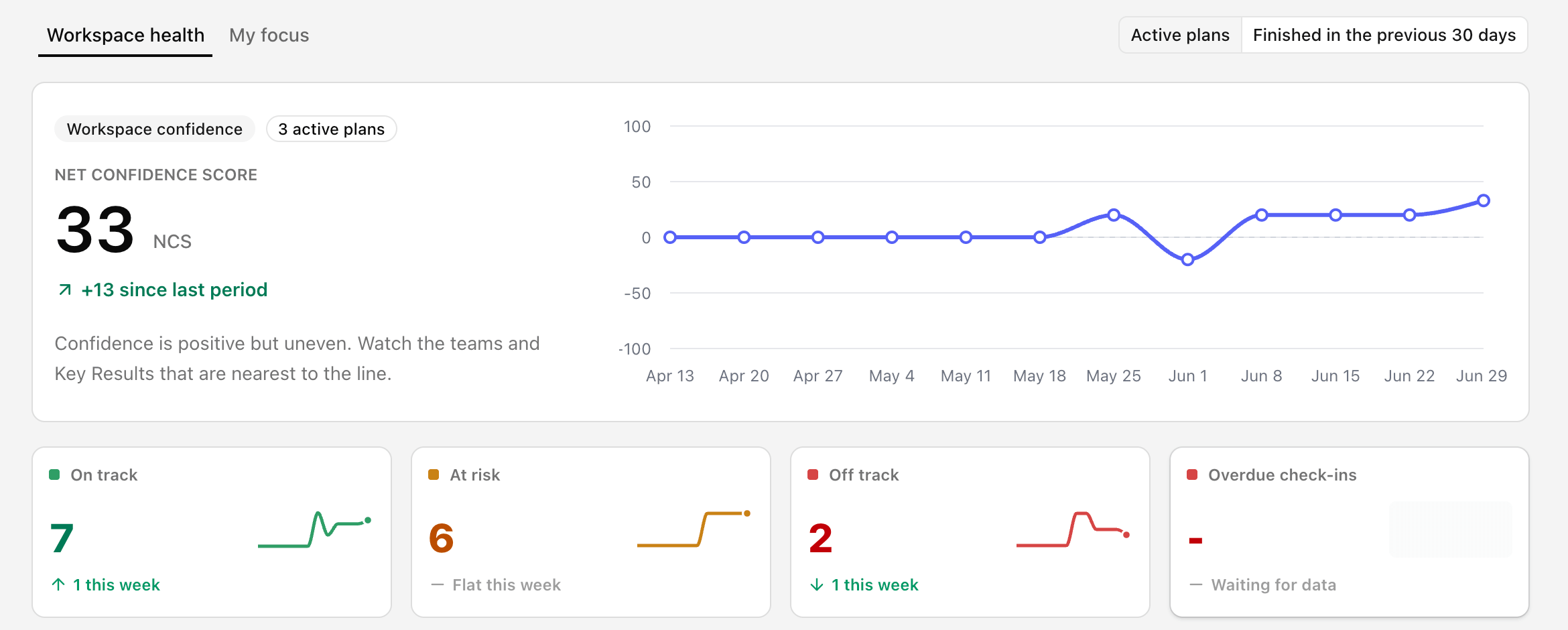
You can expand an at-risk item and read the latest check-in context on the spot, so you understand the situation before you decide whether to act on it. It is the difference between starting your review with a question and starting it with an answer.
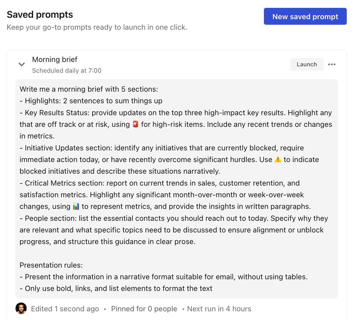
2. Reporting that runs itself
Most reporting work is not thinking. It is remembering to ask the same question on the same day, then formatting the answer.
Scheduled prompts remove that. You save your most useful AI Mode prompts, "create this week's exec summary," "what are the top risks and blockers," and set them to run on a cadence: daily, weekly, monthly, or quarterly. The output lands with your chosen recipients before the meeting, not during it.
Two things make this better than a calendar reminder. You can pin prompts for teammates, so a good reporting habit spreads across the org instead of living in one person's head. And because the prompt reads live workspace context, the summary is current every time, not a snapshot someone pulled on Tuesday and forgot to refresh.
3. Talk to your OKRs from Claude, ChatGPT, or Gemini
This is the tool power users tend to underuse. Tability's MCP server connects your OKR data to the AI client you already work in, so you can ask questions and update goals in plain language without opening Tability at all.
It is good at three things.
First, it builds complex reports in seconds. Instead of assembling a board update or a cross-team risk summary by hand, you ask for it and get it back from live workspace data. The kind of report that used to eat half a morning becomes a single prompt.
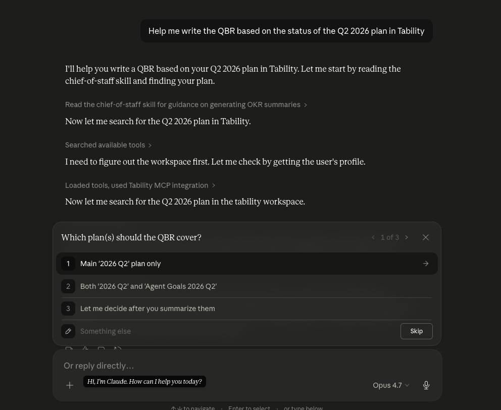
Second, it lets you investigate on the spot. Treat your AI client as an assistant: "which KRs slipped this week," "summarise where the marketing plan stands," "who hasn't checked in yet." You get an answer in seconds instead of clicking through plans to piece it together yourself.
Third, it lets you check in without breaking flow. You can post your weekly update straight from the client you are already in, so the check-in habit survives the busy weeks instead of being the thing that slips when you are heads-down. That last one matters more than it looks: the check-in is the raw material every report is built from, so anything that keeps updates flowing quietly improves everything downstream.
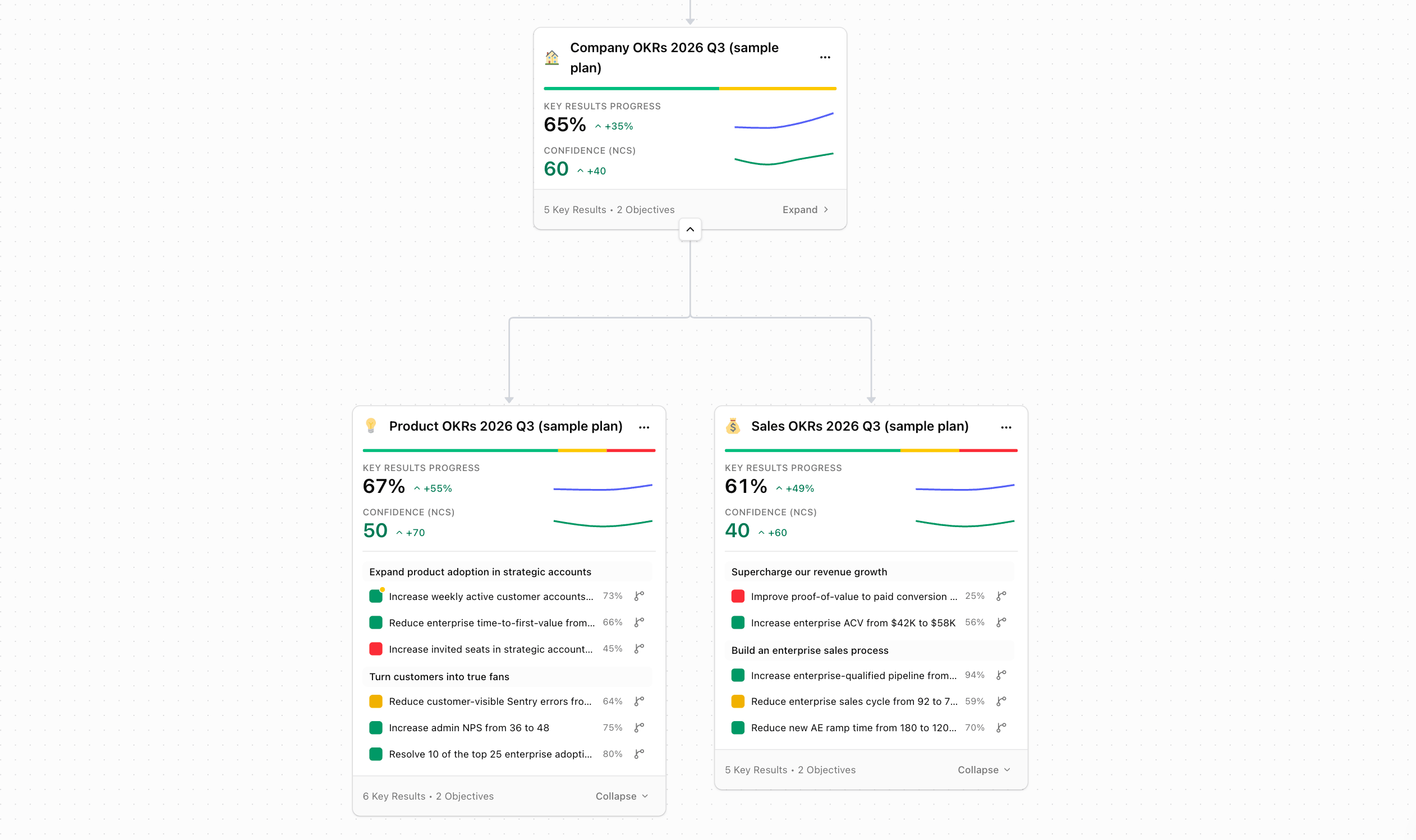
4. Alignment you can read at a glance
When every team has its own plan and every plan has its own language, alignment becomes a thing you assert in slides rather than something you can actually see.
The new Strategy Map gives you a macro view of how plans connect across the workspace, while still showing the health signals that matter: progress, confidence, objectives, and KRs. You can spot a plan with weak confidence or slow KR movement without opening it, filter sub-plans so a leadership review stays focused, and expand plan content inside the map to inspect the detail when you need it.
For presentations and reports, you can share a live view or download a screenshot, so the picture people see is the real one, not a diagram that went stale the day it was made.
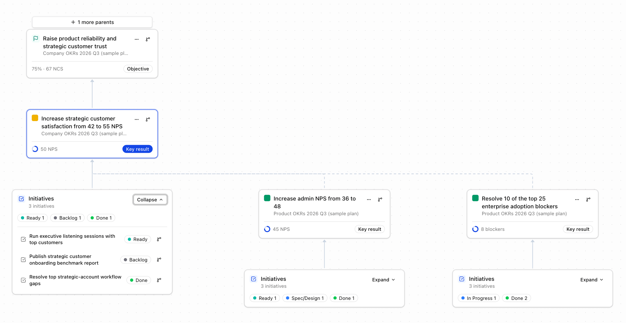
5. Trace why something is off track
Knowing a KR is off track is useful. Knowing what it depends on is what lets you fix it.
The Dependencies Map lets you start from any plan, objective, key result, or initiative and trace the parent goals above it and the downstream work that depends on it. You can switch between parent view, dependency view, or both, control how many levels deep to go, and collapse the noisy branches so only the relevant chain is visible. Hover any node and the path back to your focus item lights up.
This is what turns "this is off track" into "this is off track because the thing it relies on is blocked in another team." One is a status. The other is something you can act on.
The shift worth making this quarter
Taken together, these five tools move you from "what is the status" to "what needs attention, why, and who can act on it."
- The Health dashboard tells you where to look.
- Scheduled prompts handle the recurring reporting.
- The MCP server turns your AI client into an assistant for reports, investigation, and check-ins.
- The Strategy Map shows how it all connects.
- The Dependencies Map explains cause and effect.
None of it makes OKRs more complicated. It just takes the parts you were doing by hand and gives them back to you.
If you already run OKRs in Tability, spend twenty minutes this week wiring up one scheduled prompt and connecting your AI client to the MCP server. That is the smallest possible change with the fastest payback, and it is the easiest way to feel the difference before the quarter is out.
.png)
.jpg)