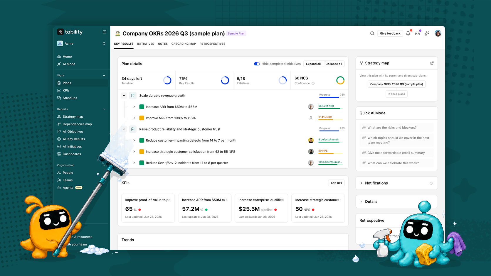
Most software gets worse the same way. Every new feature earns a new link, every link earns a spot in the navigation, and nobody ever takes anything out. Three years in, the sidebar is a museum of good intentions and new users have no idea where to start.
That happened to us. And I’m sorry.
So this release is mostly subtraction. Fewer links, fewer pages doing three jobs at once, less noise on the screens you open every morning. Here is a quick video of what changed below, and more detail in this post.
Home and Focus are one page now
You used to have a home page and a separate focus page, which meant deciding which one you wanted before you had even looked at anything. They are now the same page with tabs.
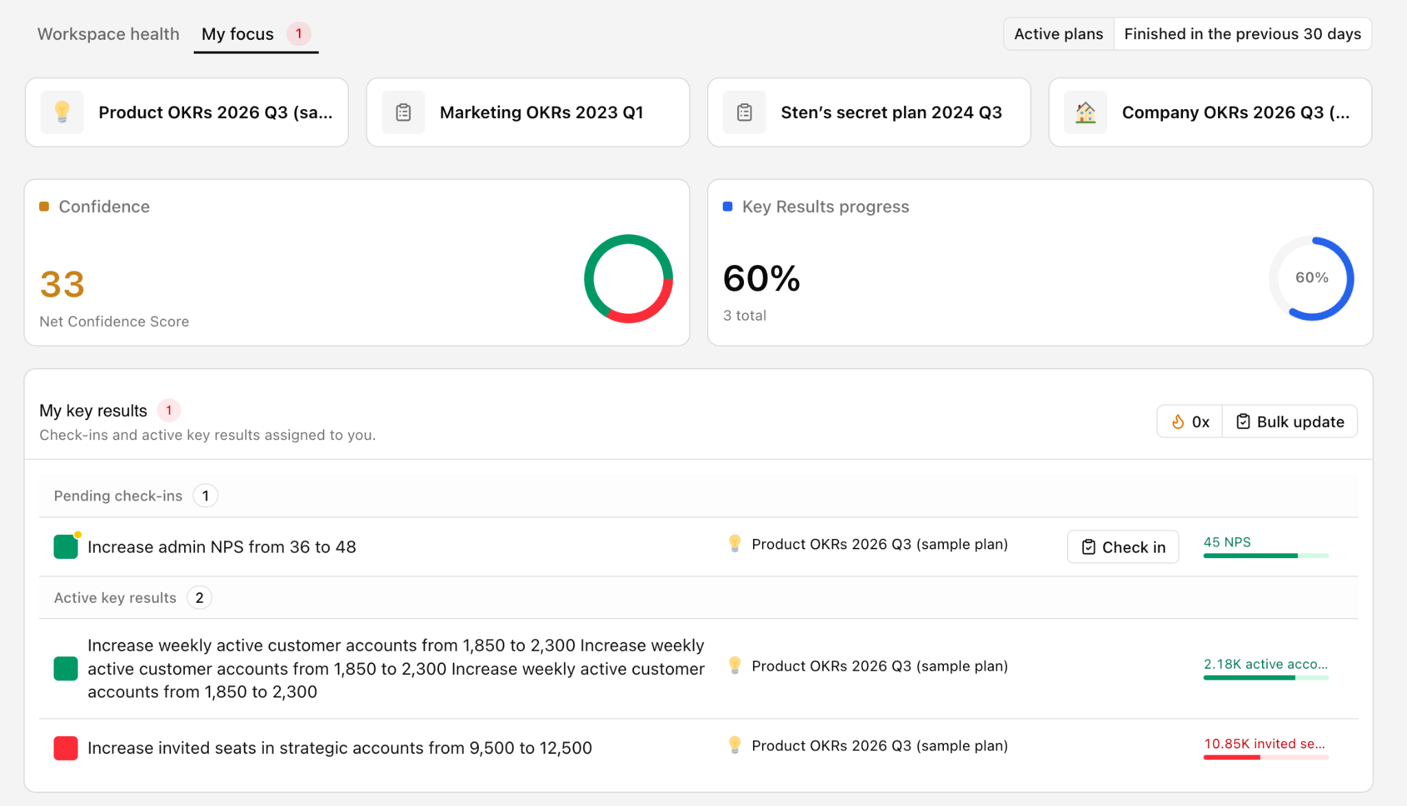
The first tab is the health dashboard. Confidence trend, how many outcomes are on track, at risk, off track and overdue for a check-in, then a breakdown of the same signals plan by plan.
That breakdown includes check-ins health, which is the column most people skip and probably shouldn't. A plan with green confidence and almost no check-ins isn't green. It's unobserved, which is a different and worse problem.
The second tab is your stuff. Your key results at the top, your initiatives at the bottom, and a counter on the tab telling you how many need updating before you click into anything.
Sections collapse. If you only want to look at one thing, you can make everything else disappear rather than scrolling past it.
Plans can be organised the way you actually think about them
Plans used to sort alphabetically, which is a fine default and a terrible fit for any real organisation. Your most important plan is rarely the one starting with A.
You can now reorder plans and sub-plans however you like, and drag them to sit under a different parent. Put the company plan at the top. Group the teams that belong together. Bury the ones nobody looks at.
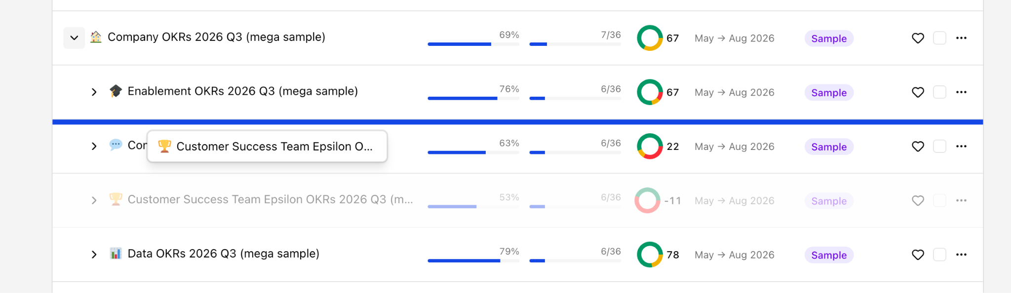
Each row shows key results, initiatives, confidence, timeline and status, so you can scan the whole hierarchy without opening a single plan.
The importer that should have existed years ago
Most teams already have their goals written down somewhere. Usually a spreadsheet, usually built collaboratively, usually finished weeks before anyone gets around to putting it in a tool. The thinking was never the hard part. The retyping was.
If you have twenty teams, adding those plans one at a time is an afternoon you are not getting back.
So: let your team draft in Google Sheets or Excel, then import the whole thing at once.
You don't need to format it first. There's no template to match and no column order to get right. If a human could open your spreadsheet and work out that it contains OKRs for several different teams, the importer should be able to work that out too.
Hit analyse, and it goes away and reads the file. You can leave the page and come back, which matters if you have dumped in something large.
What comes back is a proposal, not a result.
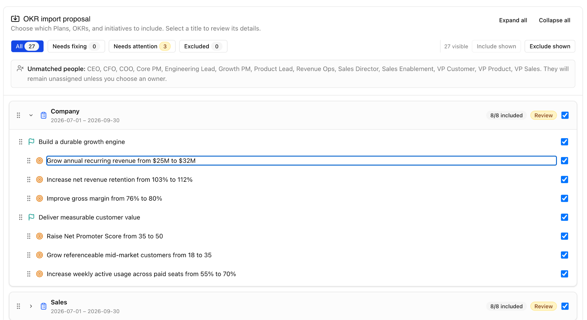
Nothing is created yet. You get a full preview of every plan, objective, key result and initiative it found, so you can check the values before anything lands in your workspace. People it couldn't match to a Tability account are listed up front and left unassigned rather than guessed at. You can set parents to link plans together, correct titles and dates and owners, and exclude anything you don't want.
Then you click import, and the lot goes in at once.
Your first set of OKRs will still be wrong in places. Being wrong in Tability in ten minutes beats being right in a spreadsheet nobody opens.
One giant filter page is now three sensible ones
Reporting was the worst offender. Objectives, key results and initiatives all lived behind a single page and one enormous filter panel, and working out how to get to what you wanted took a while. New users mostly didn't.
That page is now three links. All objectives, all key results, all initiatives.
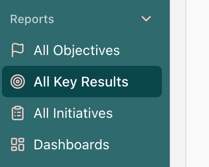
You can see what exists before you have configured anything, and switch between the three without losing your place.
The filter panel collapses when you don't need it. Presets are one click, so the common questions do not need building from scratch every time. When filters are applied you can see what is being filtered without decoding a row of chips.
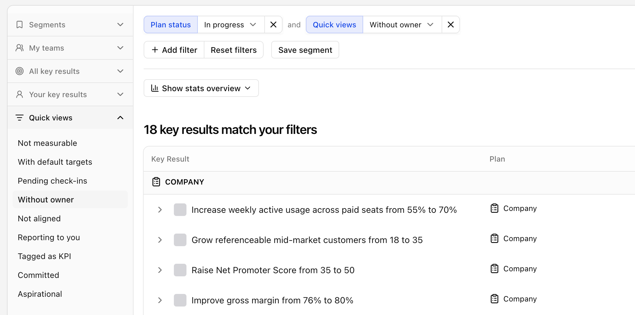
Segments still save, and now when you load one it is obvious which one you are looking at.
The presets worth running today: not measurable, with default targets, without an owner, not aligned, pending check-ins. Five clicks, and you will know more about the real state of your OKRs than most quarterly reviews turn up. They are hygiene checks and they are meant to sting a little.
What this doesn't change
Your plans, your data and your check-in history are exactly where you left them. There is nothing to migrate.
And none of it fixes a badly written goal. A key result with no target is still a key result with no target. The tool is just quicker at telling you so.
What it does change is how long it takes to go from noticing something to doing something about it. That gap is where most OKR programmes quietly die.
Go and have a look, then tell us what feels wrong. There is a give feedback button in the top bar that opens straight into a conversation with us. We read all of it.

.jpg)


.png)
(1).png)