The right executive dashboard brings all the relevant goals, metrics, and initiatives together so you can get straight to the conversation.
But, the problem is that it's often painful to build as you have to find the right platform, learn how to create dashboards, find the adequate widgets, and then wire everything together.
We've got a solution for you.
Tability's dashboard catalogue has 36 widgets that can show data related to the OKRs, KPIs, and initiatives tracked in the platform. The widgets are organised in 6 categories, allowing you to build rich live dashboards:
- Summaries: 6 widgets
- Lists: 8 widgets
- Metrics: 6 widgets
- Charts: 10 widgets
- Leaderboards: 3 widgets
- Content: 3 widgets
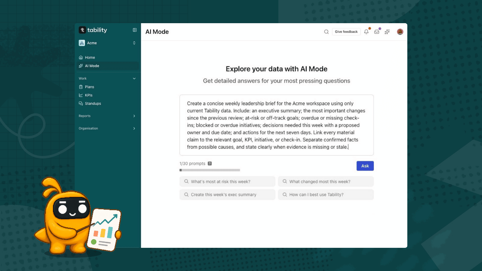
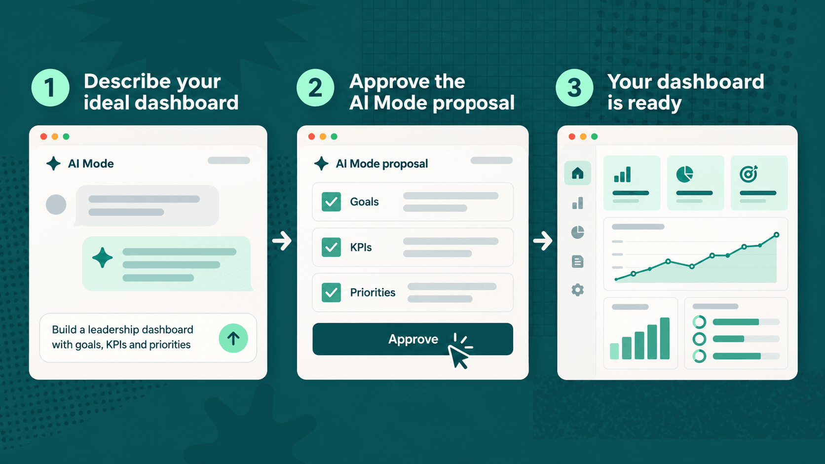
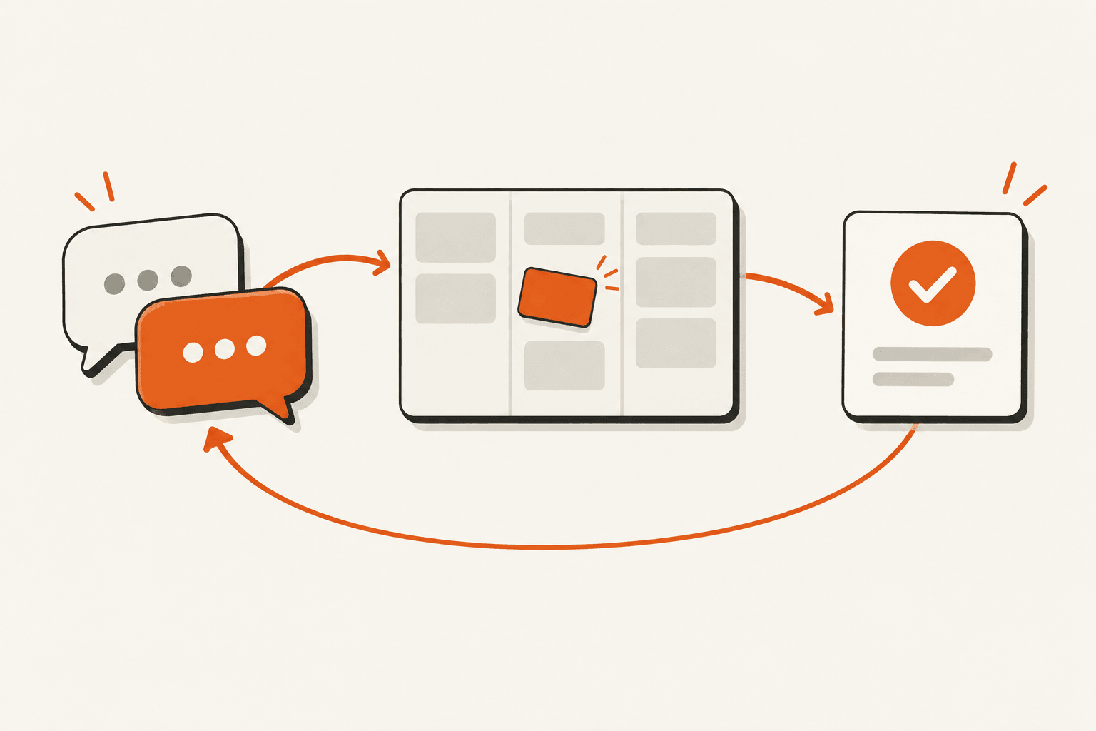
Now, the beauty of Tability's approach is that instead of having to learn how to use and lay out the widgets, you can simply use the AI Mode to describe the data that you want to see. Tability will take over to create the perfect dashboard for you.
Already using Tability? Open AI Mode to get started. If you're new, start a trial to try it with your own goals.
Tability: the source of truth for your strategy
A useful executive dashboard starts with a central place for your strategic data. Keep your goals, KPIs, and core initiatives together in Tability so the dashboard can draw on the same information your team uses to run the business.
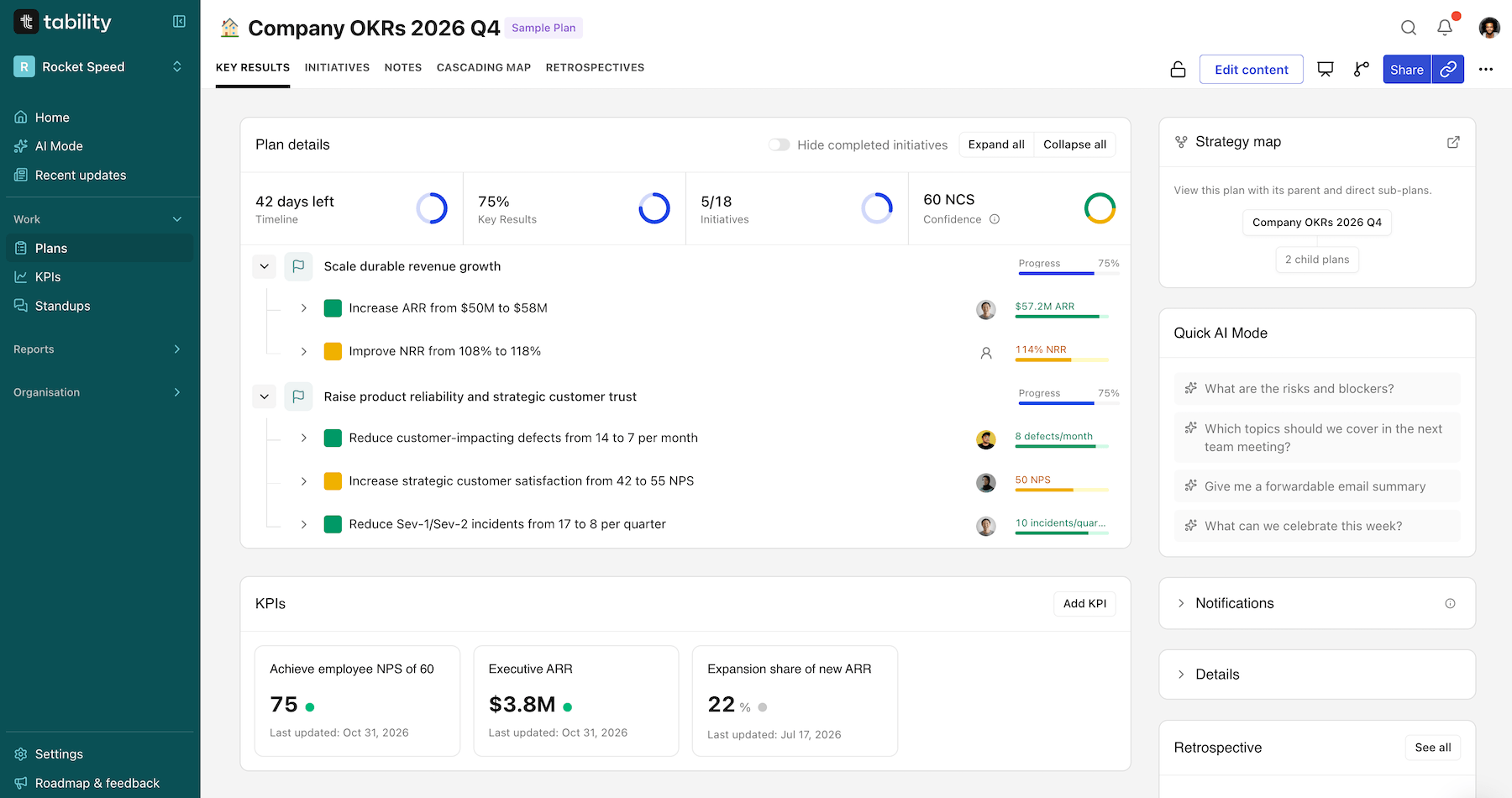
Start with your current priorities. Add the goals you want to achieve, the business metrics you want to monitor, and the initiatives that will move those numbers. Give each item an owner, keep targets and dates clear, and record regular updates.
The better you are at keeping track of your progress, the richer the data will be in your workspace.
Start with the question you want to answer
You don't need to decide on every widget before you start. Tell AI Mode who the dashboard is for, what you want to track, and the period you care about.
In this example, we want to answer three questions:
- How is the business doing?
- Are our quarterly goals progressing?
- Where does leadership need to intervene?
Here's a prompt you can adapt:
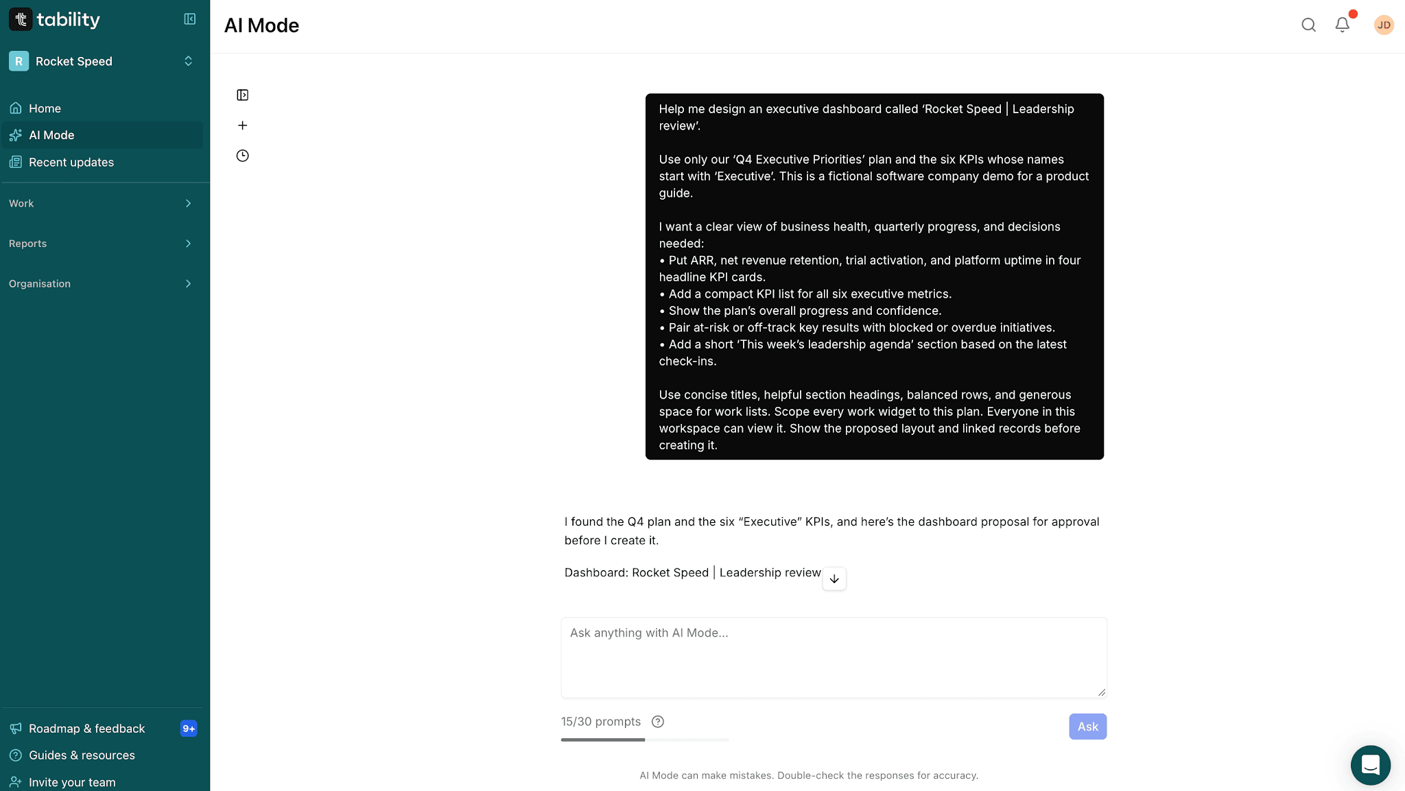
Help me design an executive dashboard called “Leadership review”. Use our “Q4 Executive Priorities” plan and the six KPIs whose names start with “Executive”.

I want a clear view of business health, quarterly progress, and decisions needed:

- Put ARR, net revenue retention, trial activation, and platform uptime in four headline KPI cards.
- Add a compact list of all six business KPIs.
- Show the plan's overall progress and confidence.
- Pair at-risk or off-track key results with blocked initiatives.
- Add a short leadership agenda based on the latest check-ins.

Use concise titles, helpful section headings, and balanced rows. Scope every work widget to this plan. Show the proposed layout, linked records, filters, and sharing settings before creating it.
AI Mode can ask follow-up questions, find the relevant records in your workspace, and suggest a structure. You can refine the proposal in the conversation: narrow it to a team, change the timeframe, or ask for a different set of metrics.
Review the linked items, filters, and sharing settings, then approve creation. You'll get a regular Tability dashboard that you can open, edit, and share.
Bring KPIs and goals into the same view
The expanded widget selection gives you more ways to tell the whole story.
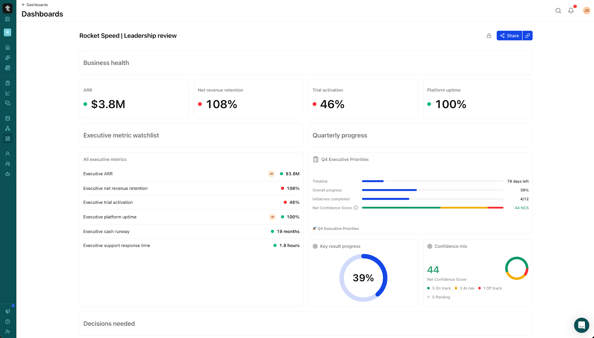
Use an individual KPI widget for a headline metric, or a KPI list to bring several business metrics together in the order you want. Pair them with plan and objective summaries, key result lists, initiatives, and progress or confidence charts.
In our example dashboard, the KPI watchlist sits beside the Q4 plan summary, progress chart, and confidence breakdown. The team can see revenue and retention alongside the goals intended to improve them, then scroll down to the key results and initiatives that need attention.
Headers and text blocks help organise the page and explain what each section is for.
Choose how much detail each widget shows
Sometimes you need the full list of work. Sometimes you just need a number that tells you where to look.
Key result and initiative list widgets can display a full list or a number summary. Use a compact count for overdue initiatives at the top of a dashboard, then keep a detailed list underneath for follow-up.
You can also customise supported count colours, rename widgets, choose their scope, and adjust their size and position. A dashboard for a leadership meeting can stay concise, while a working dashboard can leave more room for the people who need to inspect each item.
The aim is to make the important information easy to find at the level of detail your audience needs.
Let AI Mode arrange the dashboard
Choosing the right widgets is only part of building a useful dashboard. Their arrangement matters too.
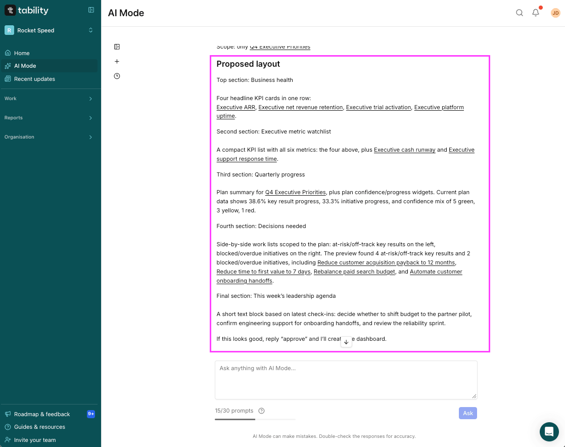
AI Mode can group related information and choose widget sizes to suit the content. It can place summary cards across the top, put related key result and initiative lists next to each other, and leave more space for content that needs it.
Describe the reading order you want: "Start with the business metrics, then show progress, then the work that needs attention." You can review the proposed arrangement before the dashboard is created and adjust it in the dashboard editor afterwards.
Start with a common use case
AI Mode includes a dashboard starting prompt, and Tability's ready-made dashboards offer another starting point for reviewing goals, initiatives, and people. If you already know the conversation you want to have, try one of these prompts.
Prepare for a team check-in
Help me design a dashboard for my direct reports.

Include their key results for this quarter and their initiatives in this quarter's plans. Group the dashboard by person, with key results and initiatives next to each other. Make progress and blockers easy to scan.

Confirm the people, timeframe, and sharing settings with me before creating it.
Keep business KPIs close to execution
Help me build a dashboard for our customer success review.

Ask me which retention and expansion KPIs to include. Put those metrics first, then show our customer success key results and initiatives for this quarter.

Use existing workspace records and show me the proposed widgets, filters, and layout before creating it.
Review quarterly progress
Help me design a dashboard for our quarterly review.

Ask me which plans to include. Propose a view of key result progress and confidence, followed by initiatives that need attention. Keep completed work visible where it helps explain the quarter.

Show me the proposed scope and layout before creating the dashboard.
Build a view for your next review
Start with the conversation your own team needs to have, then ask AI Mode to bring the relevant information together.
Tability with AI Mode is the fastest way to build complete executive dashboards – all via natural language, and zero clicks required.
You can also use the same workspace context to prepare a presentation or recurring briefing. Our guide to AI Mode presentations and reports shows how those workflows fit together.
Open Tability and try the dashboard prompt, or start a trial to build your first one.

.jpg)
.png)