
Most marketing dashboards have the same problem. Someone builds a marketing KPI dashboard with 40 charts, shares it in a meeting, and everyone nods. Two weeks later nobody opens it. The numbers are there, but nobody knows which ones matter, who owns them, or what they're supposed to do when one turns red.
A good marketing KPI dashboard does the opposite. It has a handful of numbers, each tied to a goal, each with an owner, and it gets looked at every week because it changes what the team does next.
This guide covers what to put on a marketing KPI dashboard, three examples you can copy, and a five-step process to build one that survives past the launch meeting.
What is a marketing KPI dashboard?
A marketing KPI dashboard is a single view of the handful of metrics that show whether your marketing is working against its goals. Notice the wording: against its goals. A dashboard of everything your tools can measure is a data dump. A dashboard of the few numbers that tell you if you're on track is a management tool.
The difference is the same one that separates a metric from a KPI. Page views are a metric. Qualified leads per month against a target of 400 is a KPI. Your dashboard should be built almost entirely from the second kind.
It's also not the same thing as a KPI report. A report explains what happened and why, usually once a month. A dashboard is the quick glance in between: are we on track, yes or no?
Start with the decisions, not the data
Here's the trap. Most people open their analytics tool, see what's available, and build the dashboard from that. You end up with whatever is easy to measure.
Flip it. Ask these three questions before you pick a single metric:
- Who will look at this? A CMO, a channel owner and a content lead need different views.
- What decision should it help them make? Shift budget between channels? Double down on a campaign? Stop one?
- What goal does it prove or disprove? If a number doesn't connect to a goal, it's decoration.
That third question is where OKRs help. If your quarterly goal is 'grow qualified pipeline from organic', then organic leads and conversion rate belong on the dashboard, and social followers probably don't. We cover the relationship in more detail in OKRs vs KPIs.
The marketing KPIs worth putting on a dashboard
There are dozens of marketing KPIs (we list 16 in our guide to marketing KPIs). You don't need most of them on one screen. Pick from this shortlist, and keep it to five to eight numbers per dashboard.
Mix both types. Leading and lagging indicators do different jobs. Lagging ones (revenue, CAC) tell you if you won. Leading ones (leads, conversion rate) tell you early enough to change course. A dashboard of only lagging numbers is a rear-view mirror.
Marketing KPI dashboard examples by audience
One dashboard rarely serves everyone. Here are three versions that each answer a different question.
1. The executive marketing dashboard
Question it answers: is marketing helping us hit the company number?
Keep it to five or six KPIs: marketing-sourced pipeline, CAC, lead-to-customer rate, total spend against budget, and one or two goal progress indicators. Show target, actual and a simple on-track signal. No channel detail. If you need more depth on this view, our guide to building an executive KPI dashboard goes further.
2. The channel owner dashboard
Question it answers: is my channel performing, and what should I change this week?
This is where the detail lives. For paid, that's spend, cost per lead, conversion rate and ROAS by campaign. For email, it's list growth, click rate and leads generated. Channel owners should be able to see this view update without asking anyone for a report.
3. The content and SEO dashboard
Question it answers: is our content compounding?
Track organic clicks, impressions, rankings for your priority keywords, and leads from organic. Content is slow, so review it weekly for direction and judge it monthly. Don't panic over one bad week.
How to build a marketing KPI dashboard in five steps
- Write the goal first. One sentence per goal, with a number and a date. 'Reach 400 qualified leads a month by the end of Q4' beats 'improve lead gen'.
- Pick one or two KPIs per goal. Fewer is better. If you can't say which decision a KPI informs, drop it.
- Set a target and an owner for each. A KPI with no target is just a number. A KPI with no owner is nobody's problem. Name a person.
- Connect your data sources. Pull numbers from where they already live, such as your CRM, ad platforms and analytics, rather than retyping them. Most teams start in a spreadsheet and that's fine, as long as updates are automatic or scheduled. If your data sits in tools like HubSpot, Google Sheets or Amplitude, check whether you can feed it in directly.
- Put it in a weekly rhythm. A dashboard nobody discusses is wallpaper. Review it in the same meeting every week, ask 'what changed and what are we doing about it?', and write the answer down. Our guide to the weekly check-in ritual shows one way to do this in 15 minutes.
Common marketing KPI dashboard mistakes
We see the same few problems again and again.
- Vanity metrics up top. Followers, impressions and page views feel good. They rarely connect to revenue. Keep them on a channel view if you must, but out of the executive one.
- No targets. Without a target, 'conversion rate is 2.4%' means nothing. Is that good? Bad? Improving?
- Too many KPIs. If everything is a KPI, nothing is. Aim for eight or fewer.
- Stale data. One out-of-date number makes people distrust the whole thing. Automate updates, or state clearly when each number was last refreshed.
- No story. Numbers without commentary lead to arguments about the numbers. Add a line on what's driving each change. HubSpot's piece on KPI dashboards for marketing has good visual examples if you want more inspiration.
Where Tability fits
A dashboard shows you the numbers. It doesn't tell you what the team committed to do about them. That's the gap.
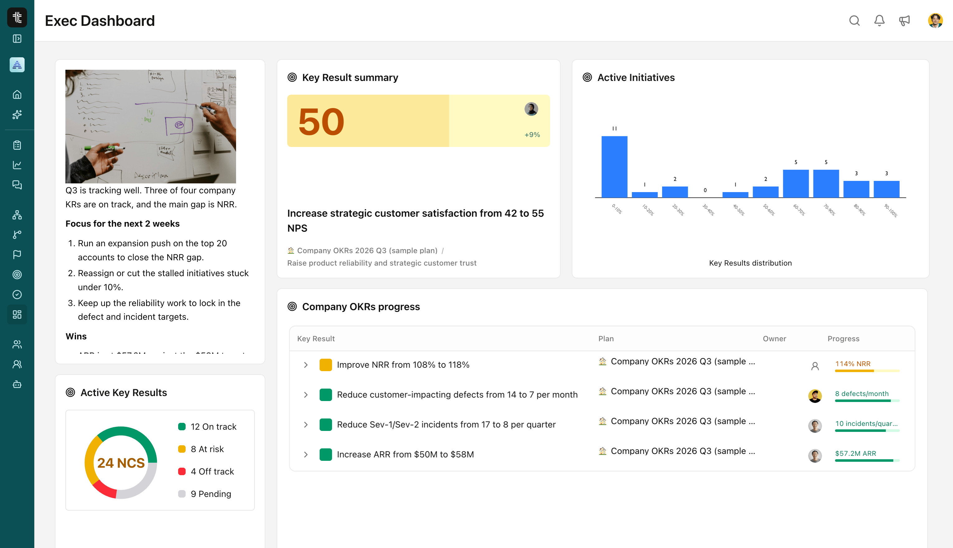
In Tability, you set the goal, attach the KPIs as key results with a target and an owner, and run a weekly check-in against them. The numbers, the commentary and the actions all sit in one place, so the weekly review is a conversation about decisions rather than a hunt for last week's slide. To see how this looks in practice, take a look at Tability's reporting features. If reporting time is the pain point, our guide on how to cut OKR reporting time is a good next read.
It's built for exactly this: a lightweight way to connect goals, KPIs and updates, without the overhead of a heavy BI or enterprise performance platform.
Wrapping up
A marketing KPI dashboard earns its place when it's short, tied to goals, and reviewed on a schedule. Start with the decisions, choose five to eight KPIs, give each a target and an owner, and make the weekly review a habit. Everything else is decoration.
Want your marketing KPIs, goals and weekly updates in one place? Sign up to Tability free and set up your first marketing KPIs, or book 30 minutes with us and we'll help you work out what it should look like for your team.


.jpg)