.png)
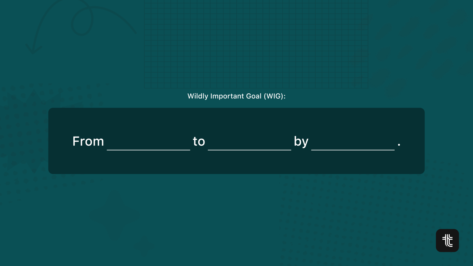
Being outcome-driven means that you focus on achieving specific results or outcomes rather than merely completing tasks or projects. It's often tempting to represent that relationship as a 1-way street (outcomes dictate outputs), but it's more akin to a feedback loop. The more you understand how your projects impact your goals, the easier it is to adjust your efforts.
.png)
The challenge for many teams is that the data relating to goals lives in one place (spreadsheets, docs), and the data relating to projects in another (Jira, ClickUp, Asana...). This makes it hard to get a clear picture of how teams are doing. The lack of complete information can lead to sub-optimal decision-making:
- You can see that a project is off-track, but there's no way to know which goal it contributes to.
- You can identify goals marked at risk in your spreadsheet, but can't see what's planned to address this risk.
- More subtle, but still dangerous: seeing a list of projects being worked on, but having no way to understand if they're the right things to focus on.
The solution is to have a tool that can map the relationships between goals and strategic projects or strategic initiatives.
.png)
This approach ensures that projects are not random or disconnected efforts but are instead tightly aligned with the organisation's strategic priorities.
Why connecting outputs to outcomes matters
You save a lot of time
The first benefit of having automated views connecting outcomes and outputs is that you'll save many hours of reporting prep. Team leads and managers often have to wrangle multiple screens and tools to put together progress summaries for the upcoming monthly business reviews.
We're easily talking about hours taken away from supporting their team. Having these summaries readily available will not only allow team leads to get their time back, but it will also empower anyone in the org to get a clear view of progress whenever they need it instead of having to wait a couple of days for someone to put a report together.
It's an easy way to reduce micromanagement
Having direct links between outcomes and outputs will minimise the inclination towards micromanagement. This is because it fosters a transparent environment where the contributions of specific projects towards the overall goals are evident. With this clarity, leaders are more inclined to trust their teams to drive initiatives forward without the need for constant oversight. It naturally shifts the focus from detailed questions about how tasks are executed to the more critical aspect of whether these tasks contribute to the desired outcomes.
As a result, team members feel empowered with the autonomy to make decisions and approach their work in ways that they find most effective. Conversely, managers can spend more time on strategic planning and building the best environment for teams to excel rather than getting entangled in the day-to-day operations.
Better visibility and alignment = max impact
Misalignment happens when teams don't have an easy way to connect their projects back to strategic goals. The more spreadsheets, docs, or tools get in the way, the harder it is for people to make sure that their roadmaps align with their team or company priorities.
On the other hand, organisations that implement systems that clearly map outcomes to outputs will make it easy for people to see how their work contributes to larger objectives. This shift towards a result-driven culture will increase transparency and make it easy to compound the impact of projects across the company.
9 views that connect team goals to strategic initiatives
Here are 9 different views from Tability that map strategic initiatives to the objectives and goals that matter.
1. Plan editor: to quickly build your quarterly plan
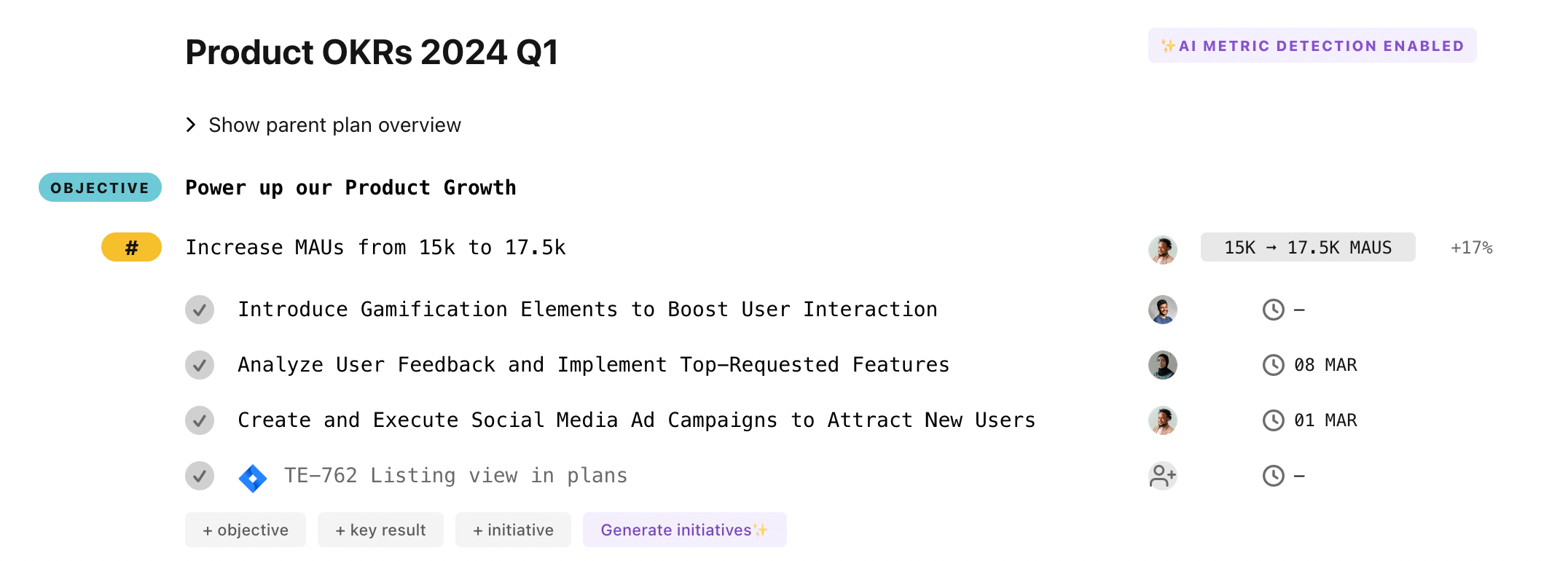
Writing a plan in a Google Doc or a Confluence page is a great experience because it has very low friction. You can use headers, lists, and indentation styles to organise your document and clearly distinguish goals from projects. Docs are great for writing blueprints.
However, as soon as you need to track progress on your plan, the docs will quickly show their limitations. The lack of standard workflows, fields, roles, filters, etc... will get in the way of having a compelling goal-tracking and project management experience. This is why teams use tools like Jira, ClickUp, or Trello instead of managing their tasks in docs.
Tability combines the best of both worlds by offering a doc-like experience in edit mode where objectives, key results/outcomes, and initiatives are clearly outlined. Then, you can switch back to the dashboard view in 1-click.
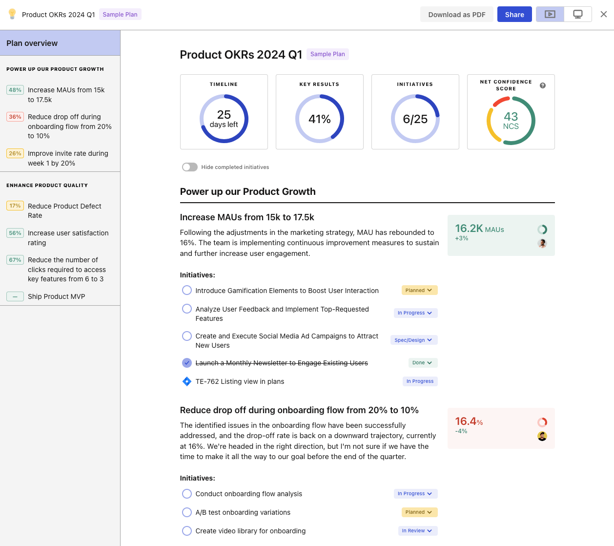
2. Plan dashboard: a result-driven overview of progress
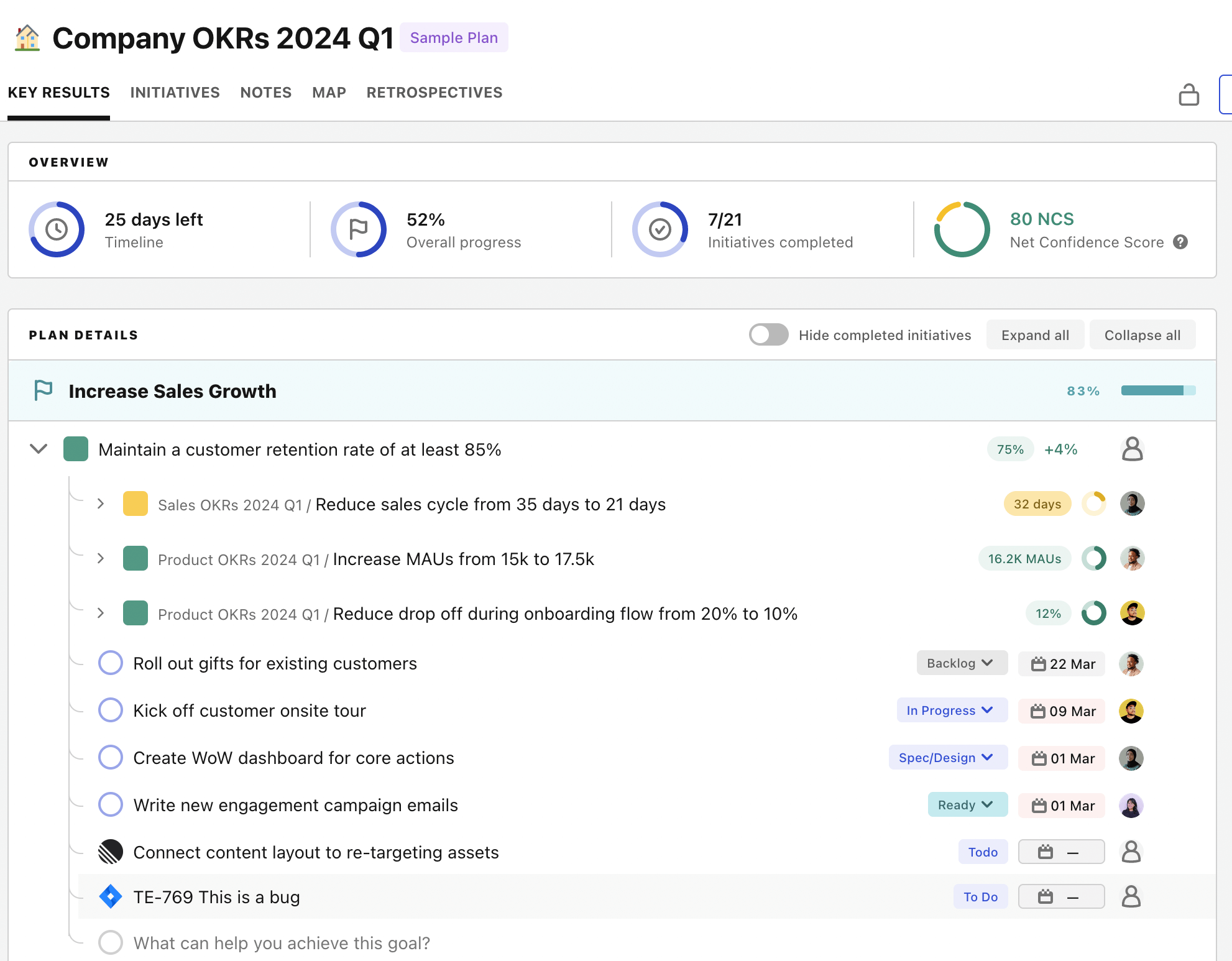
Plan dashboards will give you a quick overview of progress on goals and their respective initiatives. Unlike the edit mode, the plan dashboard contains confidence and score/metric information for the goals as well as work status information for the initiatives (it can also sync statuses from your project management tools).
The plan dashboard is a great view if you want to understand how progress toward objectives is going, both from a result and effort perspective.
If you scroll to the bottom, you will find an Insights section showing you:
- Goals vs. initiatives progress trends
- Evolution of confidence over time
- A list of overdue and recently completed initiatives
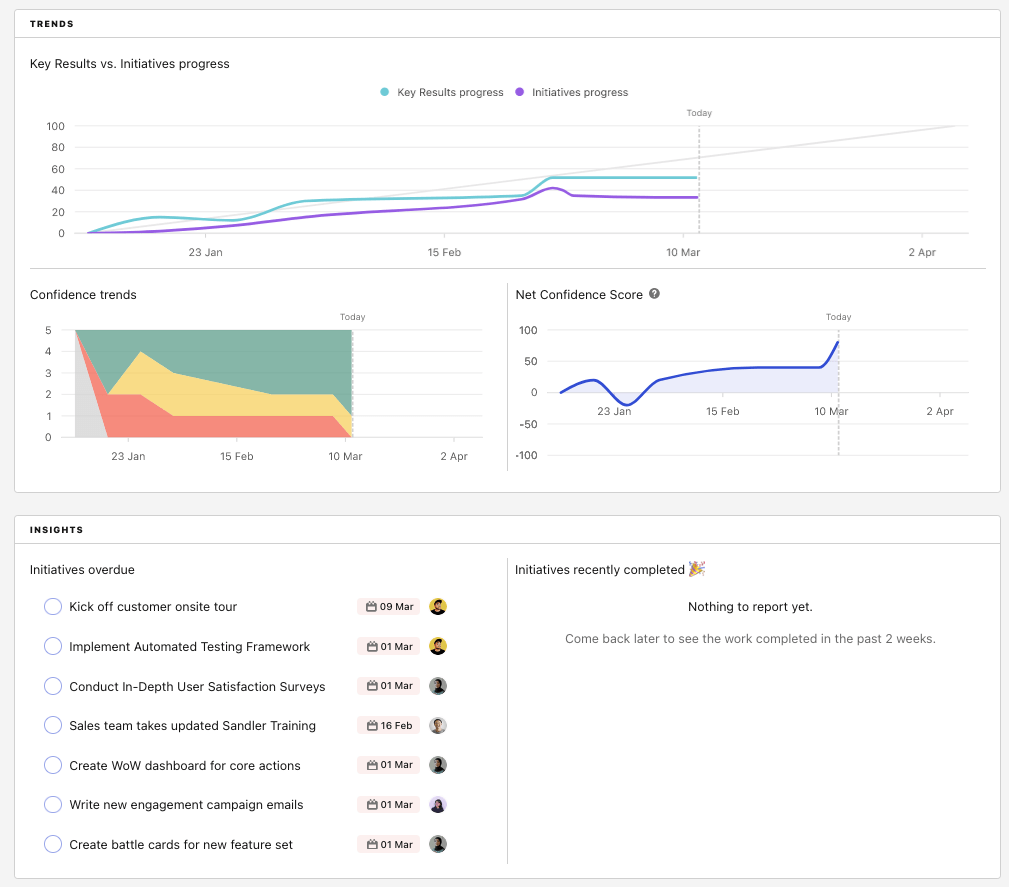
This additional set of data will enhance your ability to surface risks early as well as provide actionable insights for your retrospectives.
3. Outcome/KR dashboard: details understanding of a specific goal
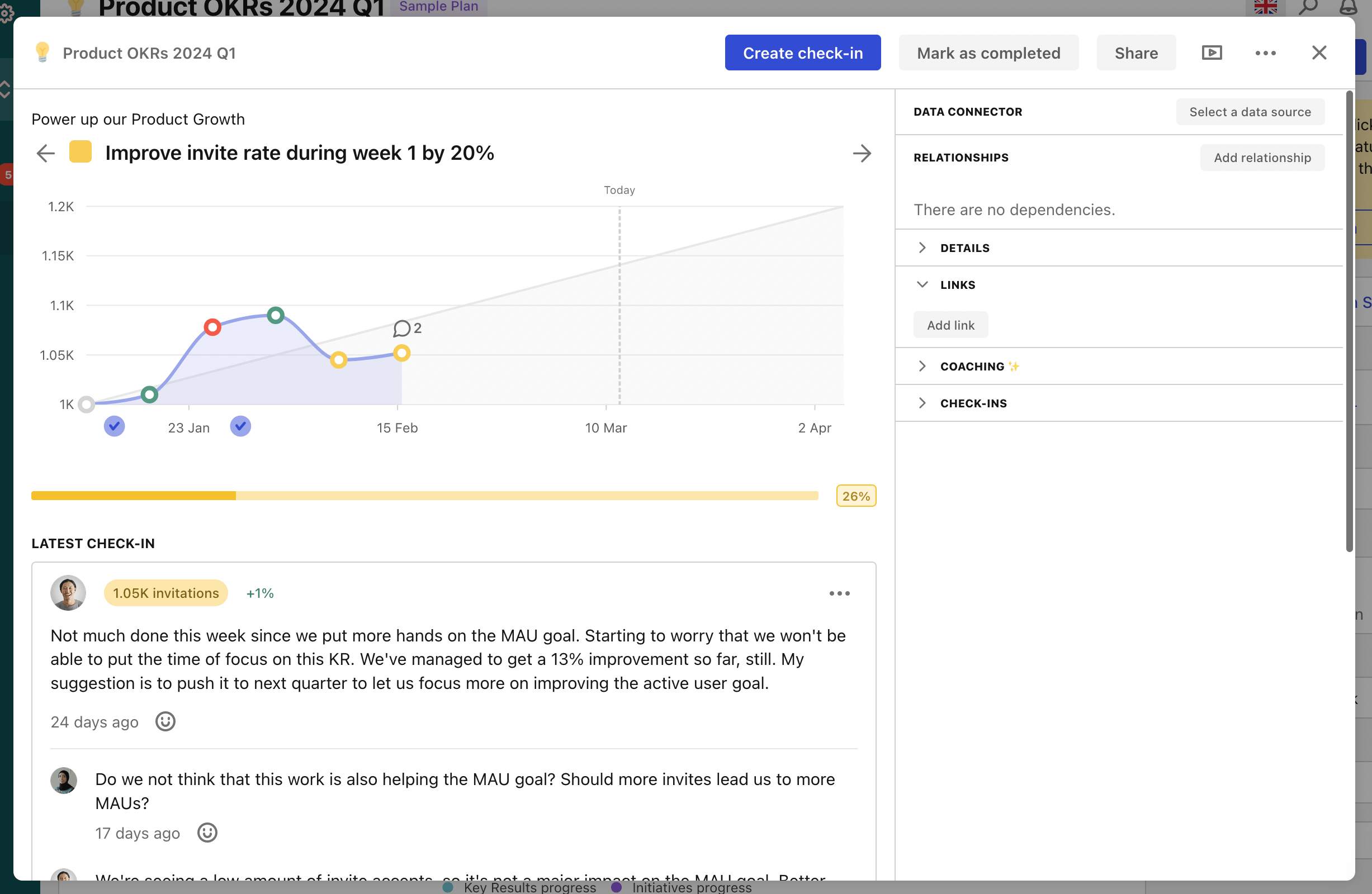
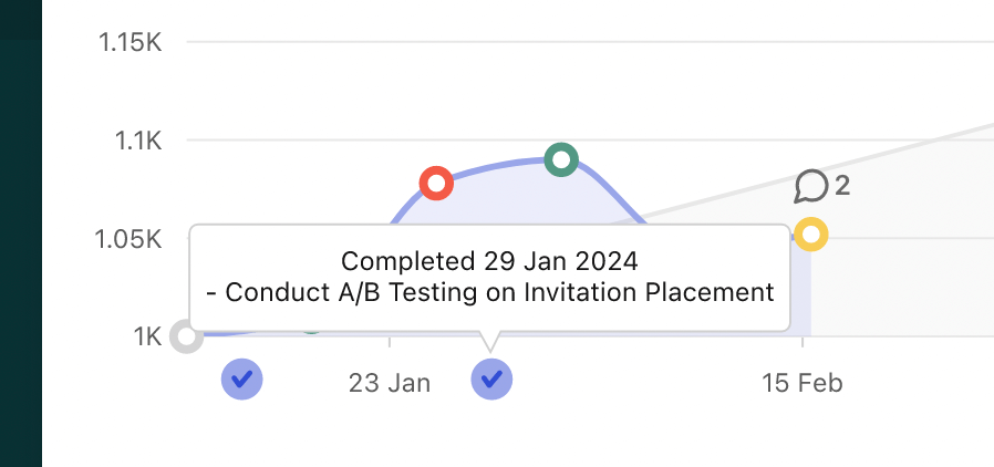
If you need to focus on a specific goal, then you can use the outcome dashboard to see a week-by-week progress chart for that specific outcomes. This chart also includes completion markers that will show you when specific initiatives were marked as completed.
This dashboard is the perfect view to see how the work you do impact your metrics. You'll also find the complete list of strategic initiatives for that particular goal at the bottom of the outcome dashboard.
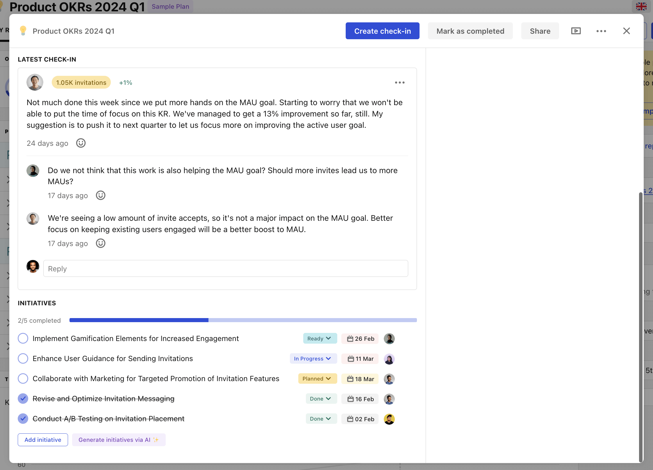
(And yes, you can also use the AI to generate relevant strategic initiatives!)
4. Presentation mode: shareable digest that's easy to read by stakeholders
Tability can turn itself into a keynote that you can use to discuss progress during your business reviews. The presentation mode will strip down the UI and remove the unnecessary buttons to focus on the content.
It uses the plan structure and progress data to automatically generate a report that can be read top-to-bottom. You can also click on individual outcomes/key results to see a focused slide for that specific goal.
5. Objective-driven Kanban: manage your work, organised by objective
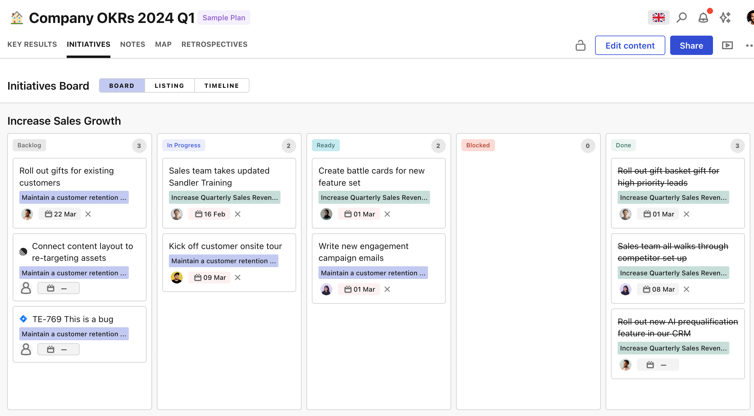
A common problem for leaders is understanding what teams are doing to achieve specific objectives. This is a question that can be answered quickly using Tability's Kanban board.
This board is unique because it automatically creates swimlanes for each objective. This allows people to scan specific rows to have a complete view of the efforts dedicated to each objective.
6. Outcome-driven initiative listing: goal-centric list of projects
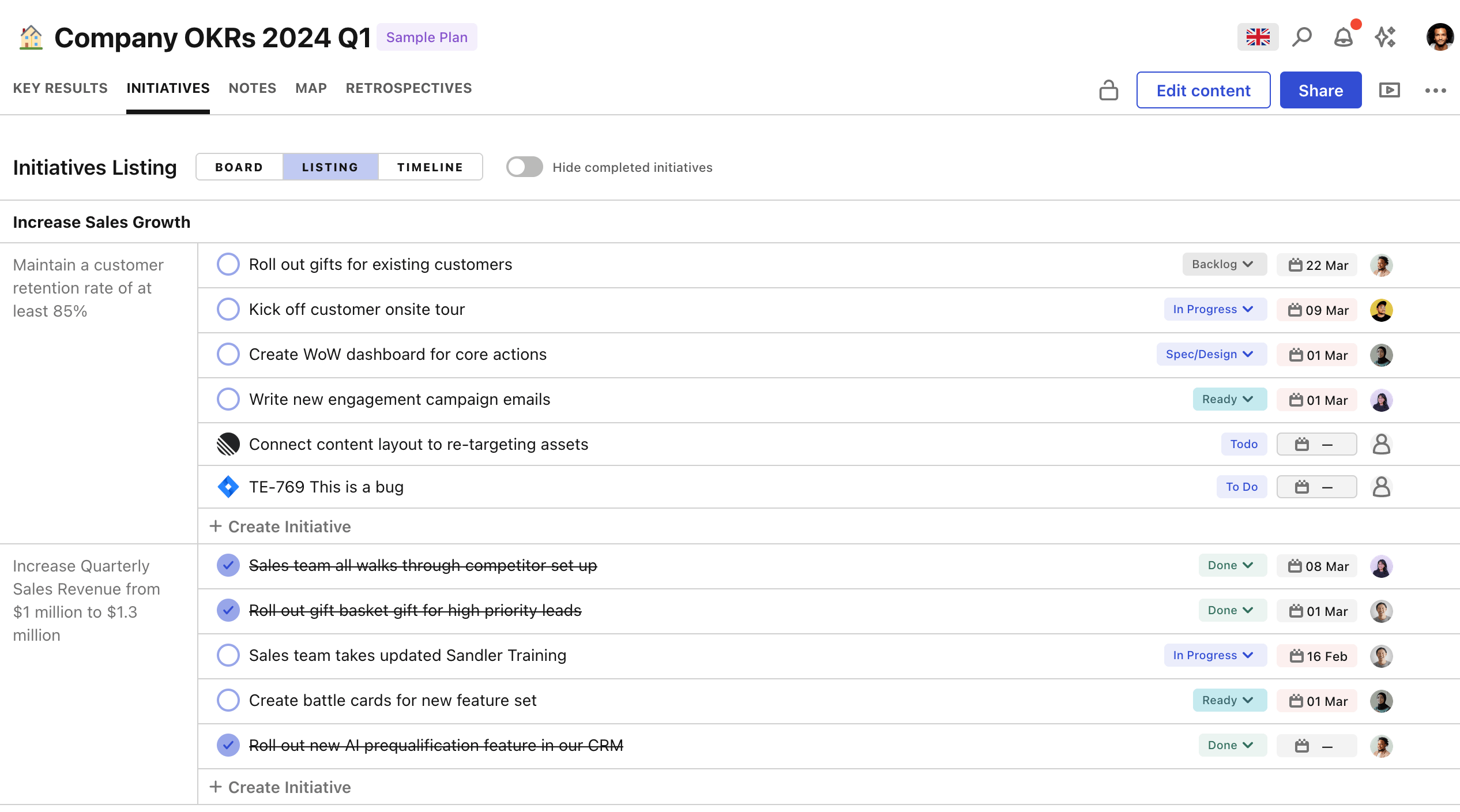
Just like the Objective-driven Kanban, the initiative listing is here to help you answer questions about the work planned in a matter of seconds.
This view groups strategic initiatives per goals, which makes it super easy to see all the work that is planned, achieved, or in progress for a specific goal.
7. Goal-driven timeline: see the project timeline for each goal
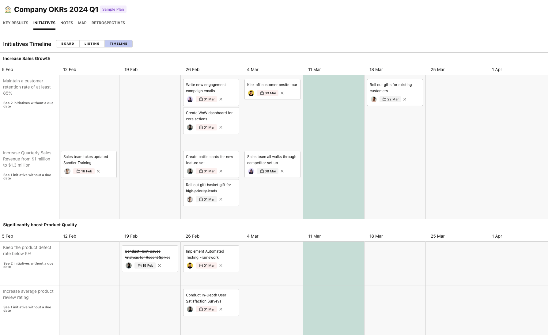
Understanding the timeline of projects can be easily done by using the goal-driven timeline in Tability.
As usual, Tability will allow you to map outputs to outcomes by creating swimlanes for each objective. This is a simple way to answer the question "what are we doing for the objective <objective>?" as you can scan a swimlane to get a complete picture.
8. Embedded plan view: see your reports in Notion, Confluence and more
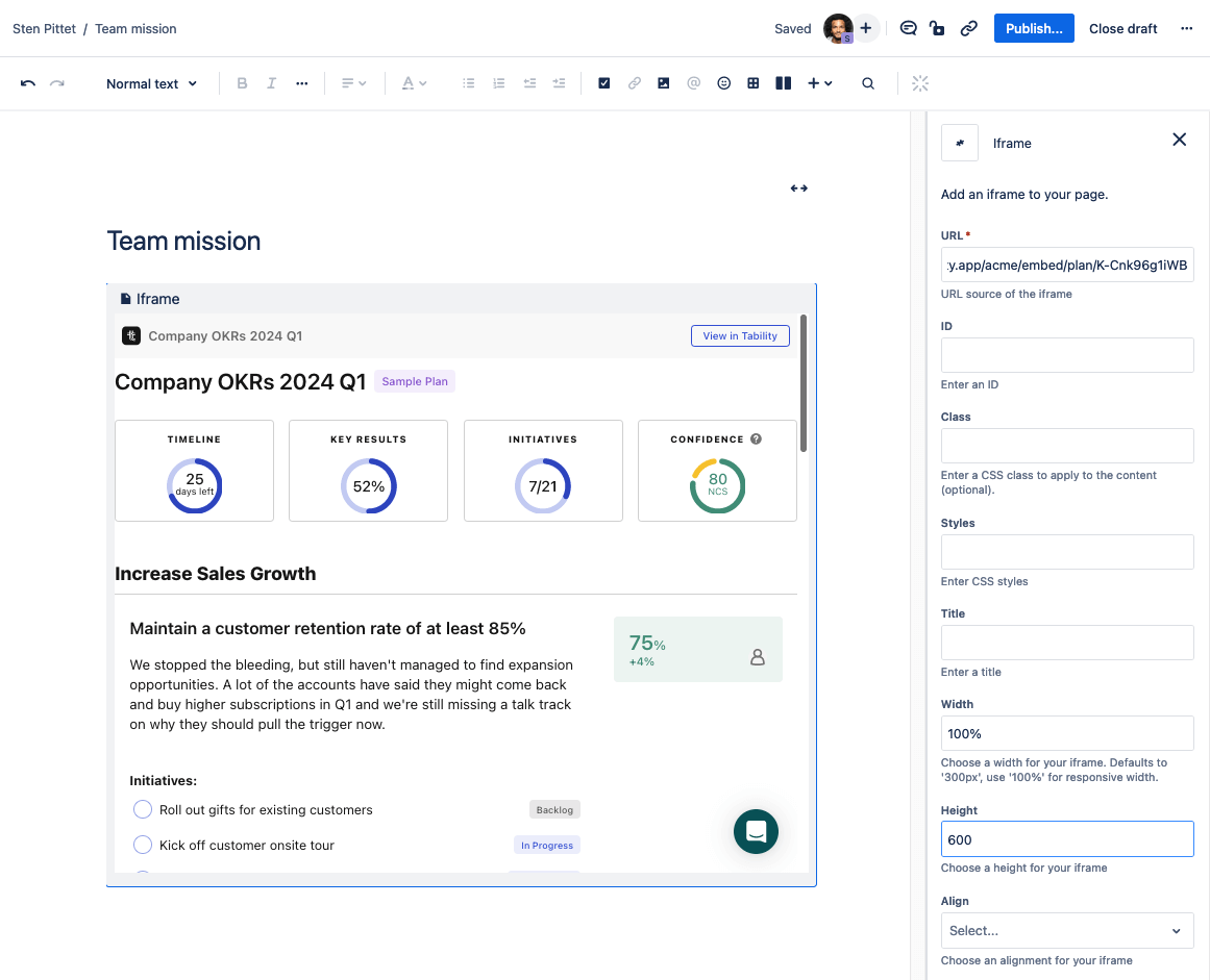
Embedding Tability's plan reports in existing Confluence, Notion, or Miro documents will offer a seamless way to integrate critical progress tracking into the daily workflows of your team. Team members will be able to effortlessly view updates and track the status of various goals without the need to switch between multiple applications or navigate away from their primary workspaces.
Having these insights readily accessible will ensure that everyone on the team stays informed about how close they are to achieving their targets, fostering a culture of transparency and accountability.
9. Cascading map: see how OKRs cascade, list their corresponding projects
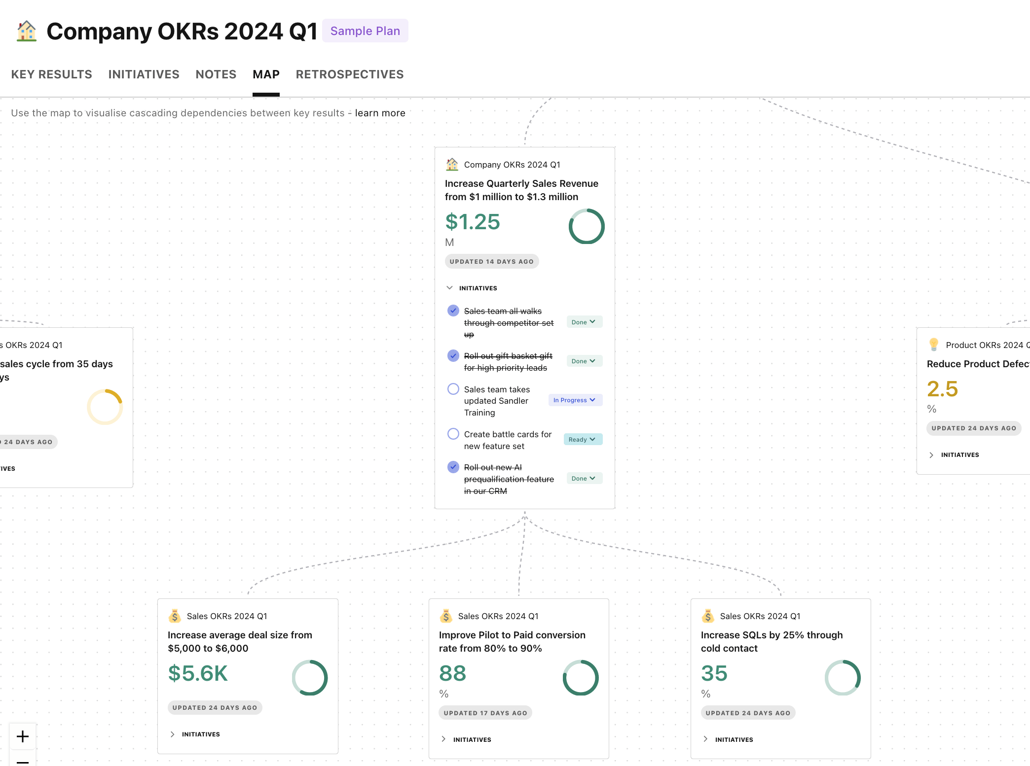
The Cascading Map allows you to trace dependencies between outcomes or key results. It's a view that allows you to follow the tree of dependencies for every top-level outcome.
You can then expand each one of the goal cards to see the corresponding initiatives, giving you a complete view of outcomes and outputs in the same picture.
Other tools and dashboards for OKRs and more
If you're looking for more ways to save time and improve transparency at work, check out these other posts:
Try these views for free
As teams become more outcome-oriented, they also become more agile. They can adapt quickly to changes to ensure that strategic objectives are achieved efficiently.
Try Tability to see these different views can save you time and foster a results-driven culture.
.png)
.jpg)