.jpg)
Making plans isn't easy. Whether it's finally catching up with your old friend from school or setting goals in business, we often put things off. Before you know it, a year has gone by with little accomplished.
While we're not experts in social theory, we know a thing or two about goal setting. After years of work, we've uncovered the secret to goal-setting and OKRs success — visualisation and tracking. OKR dashboards give you a real-time glimpse of your performance, boosting accountability and transparency. Discover how OKR dashboards work in practice and boost your OKR journey with this guide.
What is an OKR dashboard?
Let's peel it back. A dashboard is a place where critical data is displayed in a way that makes it readily accessible and actionable. In a car, your dashboard will show you speed, fuel consumption and occasional defects. The same can be done online — a good dashboard will provide a glimpse of what's going on behind the scenes.
An OKR dashboard is the space in OKR software that displays your goal progress and current workload. It's a starting point, showing you what you need to see at a glance and allowing you to follow through for more comprehensive insights. It's common to see graphs, charts and other data OKR visualisations. As OKRs are updated weekly, the information and visuals in the dashboard change in real-time.
Visualisation is the key — individual contributors can see how their work contributes to the bigger picture, and managers can keep an eye on how close they are to meeting their goals.
How OKR dashboards can help your team
Realising a vision is challenging, especially when you don't have a simple way to track progress. You can absolutely be successful without using dedicated OKRs software, but having clear dashboards to track your goals can make it 100x easier to make your dreams come true.
If you're just getting started with OKRs in Google Sheets, you've probably discovered how hard it is to get your team to buy in. That's because spreadsheets are generic tools that don't interpret the data. As a result, you get little actionable insights from the weekly reporting activity – and it feels much more like an extra chore than something that benefits the team. That's where OKRs software, and specifically dashboards, come in handy.
Here are some other ways OKRs dashboards can benefit your team.
Defined focus
On the average workday, office employees juggle their time between admin tasks, miscellaneous work and getting their 'actual' work done. With an OKRs dashboard, it becomes easier to see how tasks contribute toward wider goals. This increases engagement and helps people effectively manage their time, avoid distractions and stay motivated.
OKR charts
With OKR visualisation tools, you have a better understanding of your performance. The OKR dashboards can show you how far you are from achieving your goals in a simple way. You can just glance at an OKR chart to understand if you're on track or in a risky situation. Teams are constantly challenged to find new ways to improve and complete tasks more efficiently.
Improve transparency
Using OKR dashboards to create transparency based on shared goals will improve collaboration. Your OKRs dashboard can help you see areas that need improvement without having to comb through a dozen of spreadsheets. If your Net Confidence Score or outcomes progress is consistently off-track, you may need to improve productivity or set more realistic goals. You'll see your progress, key metrics and reminders about check-ins. Transparency is levelled up by keeping everything above board.
Automated data
Individual and organisational progress against objectives is hard to measure manually. With an OKRs dashboard, you can see real-time data and insights that are easy to digest. You can also customise your dashboard to suit your and your business's needs with filters.
Teamwork
Group performance is the backbone of effective OKRs. Using an OKRs dashboard, you can see your team's contributions to outcomes, which promotes collaboration. Teams can also reallocate initiatives if performance gaps prevent a goal from being achieved. In addition, people can provide notes on their own OKR progress and general performance to keep everyone in the loop.
OKR dashboard examples
Here are a few types of dashboards that you can get from Tability.
1. Strategy Map: to quickly see how OKRs align

OKR alignment is a critical piece of the OKR framework. Without it, you end with a bunch of teams that are working really hard, but hardly going in the same direction. The result? A huge opportunity loss as many efforts get wasted without adequate support from other teams.
But, aligning OKRs is challenging when you have to scroll through 10-15 different docs and spreadsheets. Tability's Strategy Map will help you visualise all the active and upcoming OKRs in your org.
From there you will be able to zoom in and out, compare the content of the different plans, and quickly identify misalignments that need to be corrected.
2. Cascading Map: to see how OKRs cascade

The Cascading Map goes one step further and allows you to trace dependencies between Key Results. Once you've linkedin KRs together, you can go to a top-level plan and follow the tree of dependencies for every top-level outcome.
You won't need to have all top-level OKRs to be defined in advance, unlike the traditional cascading approach which is costly. Teams can create their own OKR plans and then link KRs to their parents when relevant.
3. Personal OKR dashboard: for individual focus

It's not uncommon for an individual to have a dozen Key Results spread across multiple OKR plans. This can cause a few headaches when it's time to update progress, as you need to find all the different spreadsheets where your name appears.
You can solve this problem by using the personal dashboard in Tability. This is a view that is unique to each user and shows you all the active goals that are attached to you.
No need to hop from one screen to the other. You can write all your weekly check-ins from there without having to switch content.
4. OKR plans list: to compare teams at a glance

If you're a manager looking after multiple teams, you might have a hard time knowing who you should focus on. The plans list is here to help. It gives you a simple way to compare the progress and confidence of the teams in your org, making it easy to identify OKRs plans that look a bit unhealthy.
5. OKRs plan overview: to focus on a specific plan

The OKR plan overview will give you all the data required to understand how a specific OKR plan is doing. The top of the dashboard will give you insights on progress, confidence, and how much time is left to achieve your goals.
The bottom part of the dashboard will help you see how the different Objectives and Key Results are doing. You can also expand the different KRs to see their corresponding strategic initiatives and dependencies.
6. Key Result panel and OKR chart: for detailed progression and staying honest

Once you see a KR going yellow or red, you might be wondering how it got there. This is exactly what the KR panel is for.
This dashboard will show you the week-by-week progress of your Key Result to help you understand progress over time. It's the perfect view to identify bottlenecks early and engage with the team.
7. Presentation dashboard: for communication with stakeholders

Tability can turn itself into a keynote to make it easy to present OKRs back to stakeholders during your business reviews.
The presentation mode will strip down the UI and remove the unnecessary buttons to focus on the content.
8. TV dashboard: to show goals in the office

The easier it is to see the OKRs, the more people will keep them in mind. You can use the TV dashboard to display your OKRs permanently and make it easy for everyone to know their status.
9. Filtered KRs dashboard: to visualise OKRs across teams
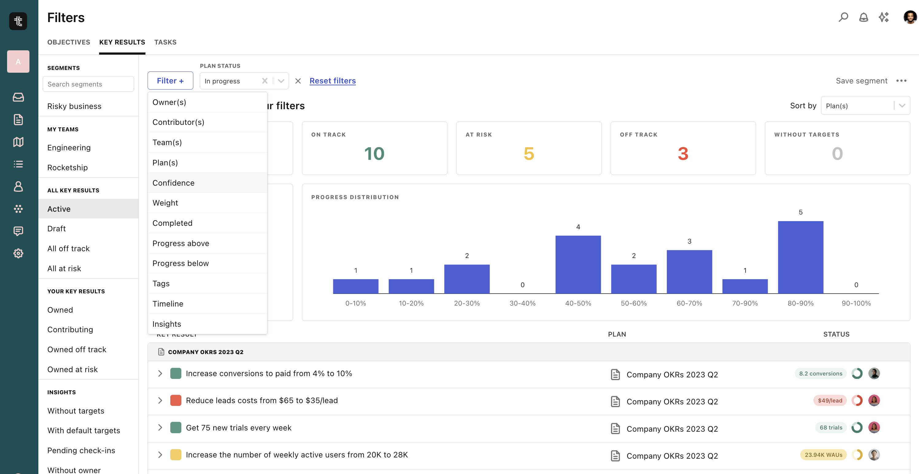
You might be interested in all engineering OKRs, or all the OKRs that relate to a specific theme. For instance, there might be a company-wide mandate to increase performance or improve NPS.
The filtered KR dashboard will allow you to slice and dice the Key Results in your org to display all the items that correspond to specific filters (ex: show me all Key Results that are red or yellow, and tagged with "nps").
10. Teammate OKR dashboard: to check on a colleague

As a manager, you might want a simple way to check on your direct reports and the goals that they own.
You can use the Teammate dashboard to see all the active OKRs attached to a specific person and see at a glance how they're do
11. Bonus: embed your OKR dashboards in your preferred tools

Embedding company and team OKRs in pages that are often visited is a simple way to remind everyone of the top priorities.
You can embed OKR plan and individual Key Results in Notion, Confluence, or any platform that supports iframes.
How to use dashboards to visualise your OKRs
Dashboards are nothing without data. On their own, they're just a collection of well-designed charts and pictures — add some facts and figures, and they create a powerful narrative. Dashboards provide an attractive, visual, data-driven aid for understanding how you're doing with OKRs.
Our OKRs dashboard is a jumping-off board and insights hub all in one place. From monitoring activity to displaying your initiatives, everything's in one easy-to-find place on Tability. Here are some features of Tability's dashboard to help you visualise your goal progress:
- Check-ins: Keep track of progress with weekly check-ins and automated reminders.
- Your initiatives: See what outputs are planned to make progress on your outcomes
- Outcomes chart: Monitor your progress toward meeting your Key Results.
- Net Confidence Score (NCS): Reveal the overall confidence in your OKRs plan with your Net Confidence Score.
- Check-ins streak: Track how many weeks in a row you've updated your OKRs.
- Recent activity: A list of changes, updates and movements across your team.
Try these OKR dashboards for free
With increased transparency and team buy-in, teams are more productive and better understand their contributions. Try Tability for free to see what an OKR dashboard and software can do for your organisation.
.png)

.jpg)